Add Menu #
Description #
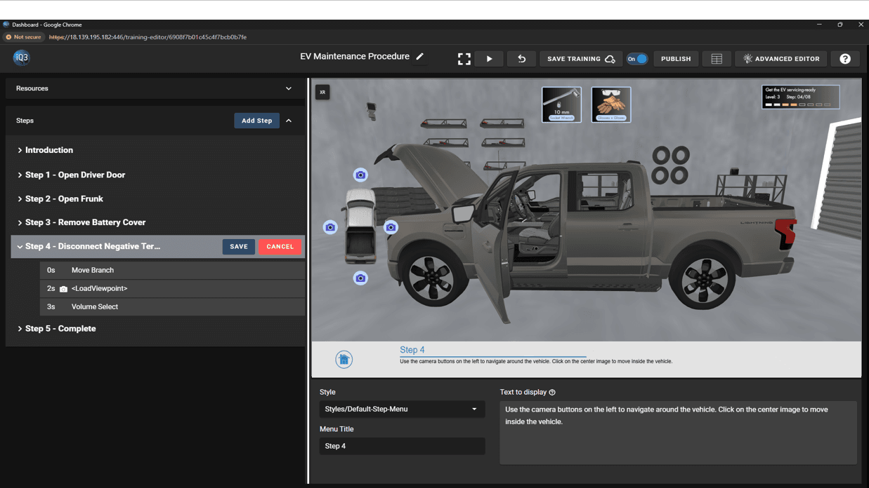
The Add Menu action provides for interactive splash screens, menus, and question templates. There are 6 different baseline configurations to choose from. The exact configuration is customizable and the font, colors, text size, etc. is controllable from a Style (see Resources).
Listed below are different types of Menus:
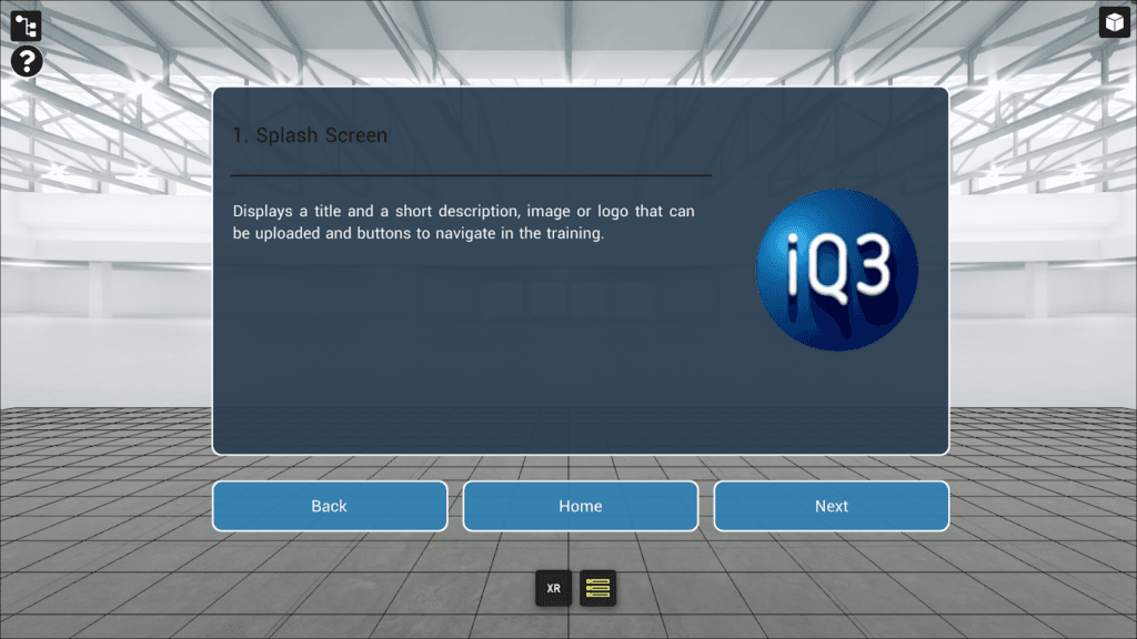
1.Splash Screen: Displays a title and a short description with an image or logo. Up to 3 buttons can be included.
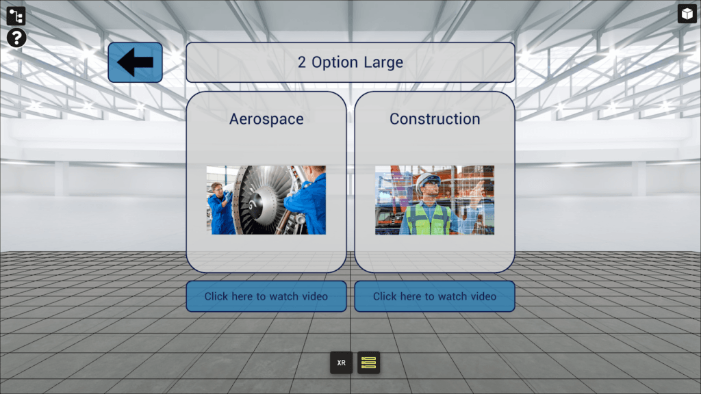
2. 2 Option Large: Allows the user to choose between two options, each supported by an image or icon.
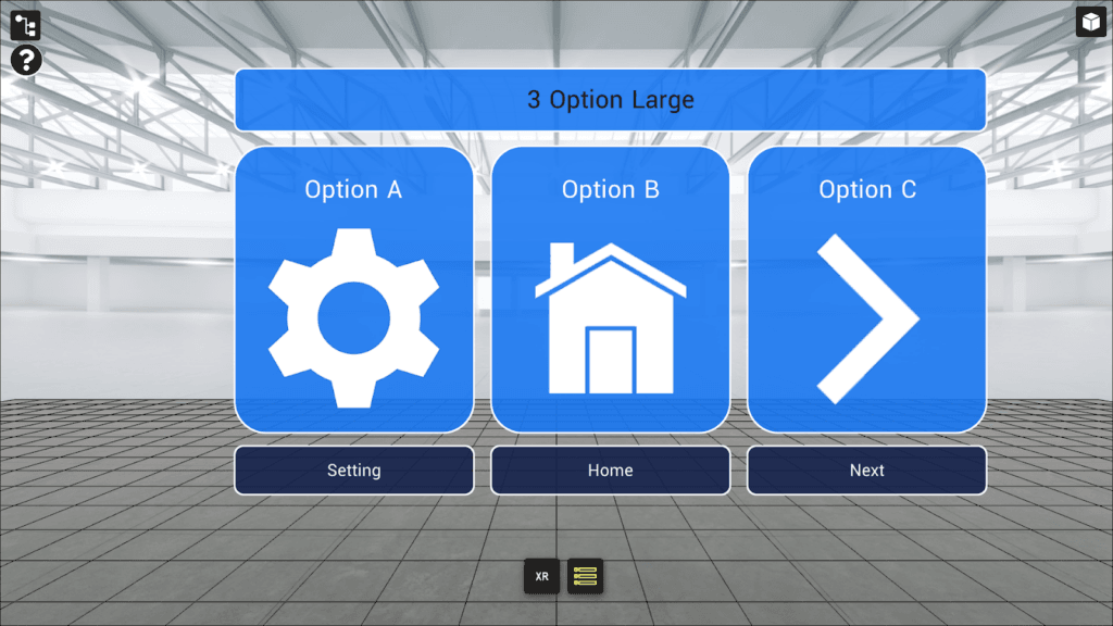
3. 3 Option Large: Allows the user to choose between three options, each supported by an image or icon.
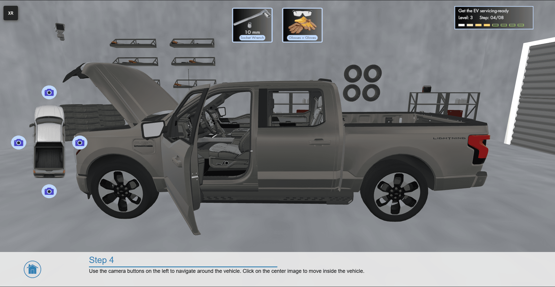
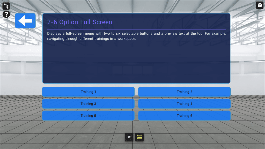
4. 2-6 Option Full Screen: Displays a full-screen menu with a title and text. Up to 6 buttons can be included.
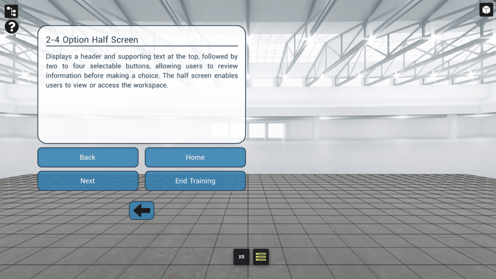
5. 2-4 Option Half Screen: Displays a half-screen menu with text and title. Up to 4 buttons can be included. The half screen enables users to view or access the workspace while the menu is displayed.
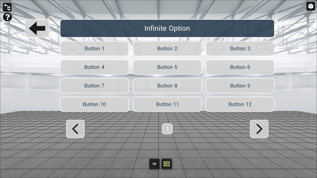
6. Infinite Option: Displays a title with an unlimited number of buttons in a structured grid layout.
#
Properties #
Start Time
The time (in seconds) when the action will activate.
The Start Time is relative to the timeline in which the action occurs (not the absolute time from when the experience starts).
Style
Controls the behavior, position, color, and the font of the Menu.
Menu Styles are created and defined under Resources.
Title
The title to be displayed.
Text
The main body of text to be displayed.
Image Type
Choose between Icon or Image
Icon– choose an icon from the icon library. The color of the icon is determined by the style of the menu.
Image– upload a custom image or use an image from the Resource Manager.
Buttons
Buttons are interactive elements in the Add Menu that can be used for navigation, selection, or to trigger events.
The button text and which timeline the button loads when clicked are customizable properties.
Each button can be enabled/disabled independently.
Back Button
Provides a back button with the Menu, allowing users to return to the previous timeline or step (as defined by the author).
Option X
Used for the 2 Option Large and 3 Option Large configurations. Each option contains an Image Type, Label, and Button Text property.