Add Action Button #
Description #
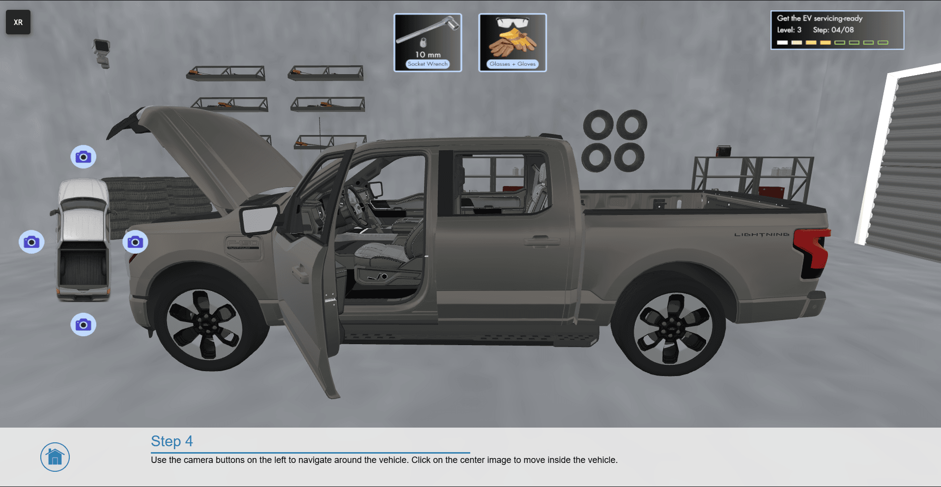
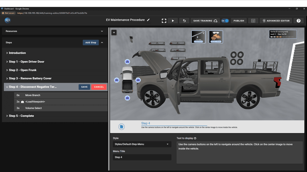
Adds an interactive button to the user interface. An Action Button is not directly tied to a specific action (such as move to the next step or start an animation) but rather it loads the defined timeline(s), which can then activate one or more actions. This enables Action Buttons to serve a variety of purposes such as for navigation, triggering events, creating a menu, etc. An Action Button loads the defined timeline(s) when clicked on by the end-user.
The position, color, and font of Action Buttons are controlled by the defined Style (see Resources). By default, Action Buttons will be placed on the right side of the screen in 2D and Tablet AR mode and will be attached to the user’s virtual left hand in HMD mode.
Up to 5 Action Buttons can be displayed at once.
#
Properties #
Start Time
The time (in seconds) when the action will activate.
The Start Time is relative to the timeline in which the action occurs (not the absolute time from when the experience starts).
Text button
The text to be displayed on the Action Button.
Style
Select from the list of available styles (see Resources).
The style controls the position, color, and font.
Timeline(s) to load
The timeline(s) to be loaded when the Action Button is clicked. Multiple timelines can be loaded simultaneously.