Styles #
Styles define the visual appearance of interface elements such as Action Buttons, Text Boxes, Step Menus, and Menus. A style controls how these elements look and behave within an experience, including properties such as font style, text formatting, background color, box color, position, size, and opacity.
Using styles helps maintain a customizable yet consistent user interface throughout an experience. Multiple styles can be created for each interface element type (for example, you could create three different styles for Action Buttons). However, each style applies only to the interface element it was created for. A style created for Action Buttons, for example, cannot be used for other interface element types.
Creating and Applying Styles #
Every experience includes default styles that are automatically applied to the appropriate objects. These default styles can be customized as needed.
To edit an existing style:
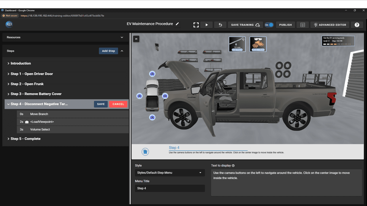
- Navigate to Resources > Styles.
- Locate the style you want to modify.
- Right-click the style and select Edit.
- Make the required changes and save.
#
Creating a New Style #
To create a new style:
- Go to Resources > Styles.
- Click the Create Style (+) button.
- Enter a name for the style.
- Select the object type the style will apply to:
- Action Button
- Text Box
- Step Menu
- Menu
- Customize the style settings.
- Click Save.
#
Applying a Style #
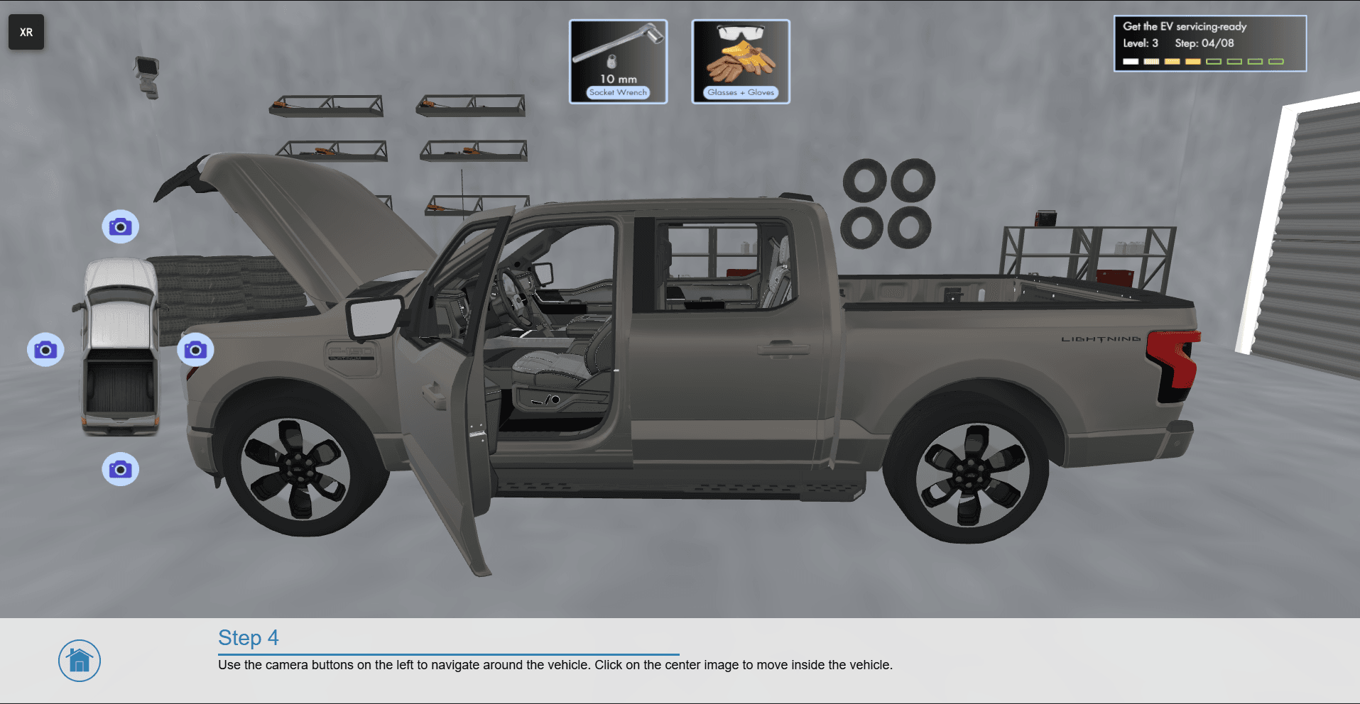
When adding an Action Button, Text Box, Step Menu, or Menu action, the element will automatically use the default style for that object type.
You can change this by selecting a different style from the available styles in the property settings for that action.
Tip: Using shared styles across multiple elements helps maintain a consistent visual design and makes it easier to update the interface later. Updating a style will automatically update all elements that use that style.